Persona User Testing Research
PERSONA: PERSONALIZED CUSTOMER JOURNEY STORIES


MORE USER TESTING
Landing Page with Logo Wall
We tested the landing page with the logo wall and got 28% CVR, increased the demo request, but 4% less the trial signup CVR (Link). Based on this, we wondered why we got these results and what influences users with the logo wall to convert. We need to understand qualitative users’ thoughts and what the logo wall means to users. Also, this testing could help engage with customers' descriptive findings collected through questionnaires and detailed observation.


New Homepage Usability Testing Feedback
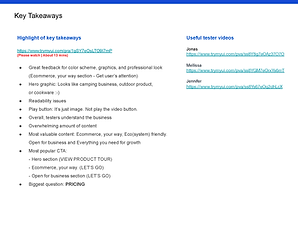
We published the Enterprise Home page. We have traffic data through the live page, but we didn’t have qualitative data that could help engage with customers' descriptive and conceptual findings collected through questionnaires and detailed observation. From this testing, we can update the content with images, discover usability problems, and create a better user experience.


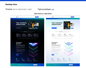
Background Testing: Dark vs. Light
We are in our 6th generation Enterprise Home page since 2009. We have improved content, features, and on supporting images, including UI/UX design. This time we implanted the dark theme with lighter text instead of the light theme we previously had. One of the ongoing debates in UI/UX design is Dark mode vs. Light mode: Which one is better? There could be many different opinions depending on multiple conditions. The light mode for readability, especially with long-form content, is better, but the dark mode is great in low-light environments with mobile view. We want to gather feedback from this testing on which theme with current content works better and why. Also, we want to know the right font size and contrast on different background colors. But we have to keep in mind the differences and the quality of impact both themes may have on the user focus.


Mobile Stick-to-Scroll CTA Options
We tested two different visual treatments with the same order: Call Sales:1-888-248-9325 and Log in at the bottom. We tested separate CTAs orders and locations after this user testing. We want to know which option can provide a better user experience, increase the number of leads, and provide easy access to contact or log in for this testing.
Option A) primary CTA being the sales number, and secondary being log in
Option B) primary CTA being the log-in and secondary being the sales number


MORE UX RESEARCH
Mobile - UX Essentials Competitive Research
By providing an optimized mobile experience, we can avoid our potential customers being frustrated trying to figure out what they need. Also, from these findings, we will drive more quality traffic to the mobile experience and increase sales by providing customers with a more convenient alternative than our competition.
-
Discover the differences between the desktop experience and the mobile experience.
-
Make the best practice for navigation structure and animation.
-
Find onboarding steps on the mobile view.
-
Compare what competitors have and what we don’t.
-
Learn how competitors display product features.


UX Essentials User Flow / Mapping Research
Research Key Takeaways
-
Pricing Pricing and Pricing
“All roads lead to pricing” Most of the user flow includes Pricing.
-
Enterprise vs. Essentials
More than half of users come from Enterprise Home, and they navigate back and forth between Enterprise and Essentials. We need to pay more attention to providing easy, simple user flow and clarify what is different between the two sites.
-
User Ecosystem
We need to observe and provide the best practices on how we can facilitate easier navigation through all sites by creating frictionless interactions and smoother user flows.
-
Resources
Resources open four different sites, which are Support, App Store, Enterprise<BC University, and Blog. Let's consider having the hub page provide all pertinent information for users.
-
Optimize User Flow for Mobile View
We can consider two separate flows/checklists for desktop vs. mobile and adjust the steps in each flow/checklist to the given UI.

