Dish Anywhere
Dish Explorer Second-Screen
Dish Anywhere
PROJECT OVERVIEW
The DISH Anywhere app allows subscribers to watch every TV channel they have at home on mobile devices and tablets. Users can stream live or recorded programs anytime, anywhere. The app also includes a full-featured DVR manager and a searchable program guide, giving users full control over their home television experience remotely. This was the second app developed by our UX team, following DISH Explorer, and it achieved an App Store rating of over 4.0.
ROLE AND RESPONSIBILITY
-
Collaborated closely with UX designers, product managers, and engineers to deliver visually compelling and effective user experiences.
-
Defined and maintained a consistent visual language across product interfaces.
-
Iterated on design solutions through continuous feedback from users and stakeholders to improve usability and product quality.

WHAT DOES THE DISH ANYWHERE APP OFFER?
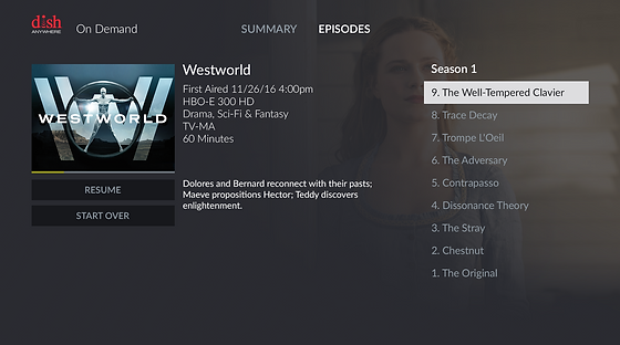
The DISH Anywhere app lets subscribers watch live and recorded TV, access on-demand content, manage their DVR, download shows for offline viewing, and control their home TV—anytime, anywhere, from their mobile devices.

COMPETITIVE RESEARCH FOR MOBILE VIEW
We conducted competitive research on key screens—such as sign-in, menu, home, and guide—by analyzing similar features across platforms like Netflix, Amazon Prime Video, DirecTV, Hulu, and Xfinity. This analysis helped us uncover new opportunities, identify user expectations, and define the exact content and functionality needed to better serve our users.
CLICK IMAGE
TO ENLARGE

INFORMATION ARCHITECTURE

CLICK IMAGE
TO ENLARGE
HIGH-FIDELITY WIREFRAME
CLICK IMAGE
TO ENLARGE

UI DESIGN PROCESS
Before I joined DISH, one of the designers had created the first DANY feature using branding elements that included drop shadows, gradients, and glossy graphics. Recognizing that the visual style was outdated for 2016, I introduced a modern flat design with a dark theme—something DISH hadn’t used before.
I carefully blended this new approach with DISH’s existing brand elements to maintain consistency. The feedback was overwhelmingly positive: users experienced less eye strain and found it easier to focus on video content with the new dark theme.
Legacy UI&UX Design


UI DESIGN LAYOUT WITH GRID SYSTEM
We tested various dimensions to embed multiple videos in a 16:9 aspect ratio. However, due to limited screen space, we faced challenges displaying multiple videos simultaneously. To overcome this, we explored several layout options and delivered pixel-perfect specifications to the engineering team for implementation and testing. Ultimately, we designed an optimized solution tailored for the iPad 9.

Phase 1
Video Aspect Ratio
288x162 px & 672x378 px
Spacing 8 &16px

Phase 2
Video Aspect Ratio
272x153 px & 640x360 px
Spacing 8px

Phase 3
Video Aspect Ratio
288x162 px & 672x378 px
Spacing 12 &12px
Final Grid System and Dimensions


FINAL MOBILE & TABLET UI DESIGN
I was fully responsible for the visual design across both mobile and tablet platforms—there were no other UI designers involved at the time. I created everything from scratch, and since DISH didn’t have an established visual guideline then, I had the freedom to explore and apply my creative ideas. At the same time, I was mindful to preserve DISH’s overall look and feel. The result was a significant improvement in both UX and UI, and the redesign was considered a great success. I’m especially proud of this project—I poured my passion into every single screen, crafting an experience that truly elevated the product.
Mobile Design
CLICK IMAGE
TO ENLARGE


Tablet Design


Dish Explore
PROJECT OVERVIEW
DISH Explorer is a second-screen iPad app that blends program discovery, social media engagement, and remote-control features. It highlights trending TV programs in real time and integrates with Facebook and Twitter, providing users with a more intuitive and socially connected TV experience.

ROLE AND RESPONSIBILITY
I led the overall UI design effort for the product, covering structure, wireframes, and visual design. Working closely with contractors, product managers, and the engineering team, I developed a new visual direction for DISH’s app and extended it across web and set-top box interfaces.
The final design was cohesive, visually appealing, and effectively reflected DISH’s brand identity and values.
WIREFRAMES FOR KEY SCREENS


EXPLORER

EVOLVING THE BRAND THROUGH MODERN UI DESIGN
When I began designing, I followed DISH’s branding guidelines to ensure consistency and strong brand recognition. At the same time, I saw an opportunity to expand creatively by introducing modern graphic styles and new accent colors, such as orange and blue. I also led the introduction of a dark theme, which improved visual appeal and user comfort. This balance between consistency and innovation contributed to strong user feedback and helped maintain our mobile app rating above 4.5 on the App Store.


Amazon Fire TV Platfom
PROJECT OVERVIEW
This Product is the DISH Anywhere(DANY) application for the Amazon Fire TV platform. DANY on Fire TV supports existing content sources, including Live TV and DVR from set-top box. Dish worked to stream by partnering with Roku, Fire TV, and Chromecast. We designed our applications into their platforms to give popular Dish entertainment to our subscribers.

+

ROLE AND RESPONSIBILITIES
I focused on the overall product UI design, including product structure, wireframes, interactive prototypes, and visual design. I also managed and oversaw visual designers and contractors to ensure consistency across the 10ft platform. Additionally, I collaborated closely with contractors, product managers, and the engineering team to align design efforts
DESIGN PROCESS
One of our contractors developed the initial wireframe (Phase 1). After building and testing it, we created a second-phase wireframe based on user testing feedback. The most significant issue we discovered was the top main navigation: it included all pages, which made it difficult to navigate using a remote. To solve this, we reduced the main navigation to four core tabs and added secondary navigation for Search, Settings, and Help, represented by icons. We also introduced a “See All” function on the home page, allowing users to easily browse programs without having to drill down multiple levels. On the media page, we found the layout too distracting, so we refined the visual language and replaced it with a slider that lets users browse programs horizontally from right to left.
Wireframe Phase 1+
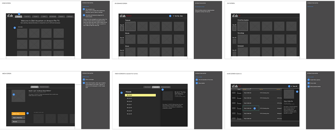
Wireframe Phase 2+

USER TESTING WITH THE FIRST BUILD
These screenshots show our user testing of the first build with the Phase 1 wireframes on a TV. During testing, we identified issues and found ways to improve the layout, visual design, and structure. We always tested our product at a 10ft distance using a remote, which is a completely different user experience compared to using a touchscreen or mouse.
CLICK IMAGE
TO ENLARGE