top of page
PROJECT OVERVIEW
We have obtained data indicating that over 60% of users abandon the payment process after selecting a plan across various use cases, such as completing a 14-day trial, visiting the Bigcommerce portal site, or accessing the product. The abandonment rate is higher than anticipated, so we are exploring various options and funnels to address this issue.
GOAL
Our goal is to convert potential customers into paying customers by providing them with the best funnels and user flows for completing the payment process. In addition to making the payment process seamless, we also want to help customers select the best plan for their needs. To achieve this, we offer four different plans, making it easy for customers to compare and choose the right one. To further improve our conversion rate optimization, we need to gather and analyze more data to identify any pain points in the payment process. By doing so, we can make data-driven decisions on optimizing our funnels and user flows and ultimately increase our conversion rate.
UX RESEARCH - PAYMENT PROCESS
I researched competitors focusing on their onboarding funnel with checkouts to gain insights and inspiration for our process. This research has been instrumental in identifying areas where we can improve our checkout process. Each company has different use cases, and by analyzing their best practices, we can learn and apply them to our payment funnel.


UX RESEARCH - SUBSCRIPTION PRICE INCLUDING OR EXCLUDING TAXES
There are many ways to handle taxes in the checkout process, and through segmentation research, we have identified the best interface and display options to ensure clarity for users. By presenting tax information clearly and understandably, we can help users avoid mistakes and fully comprehend their tax payments. This research has been invaluable in improving the user experience and ensuring a smooth checkout process.


CRO TESTING
Checkout Funnel - Abandonment Rates

Pricing Page - Evidence

Trial CTR


PRICING STRATEGIES WITH RECOMMENDATIONS
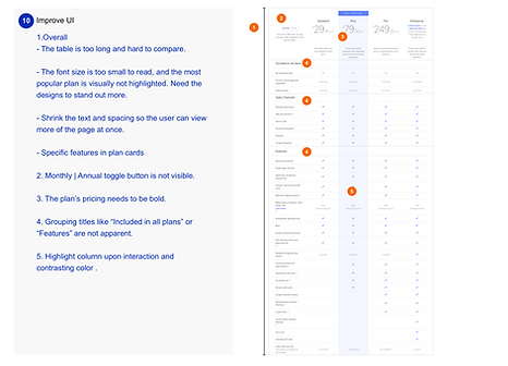
Having thoroughly researched and analyzed our pricing feature, which is an essential aspect of our payment processes, I have developed 10 recommendations accompanied by detailed explanations for why these functions are necessary. These suggestions help identify the features we need to implement to improve our pricing feature and enhance our overall payment process.


.png)

EXPLORING USER FLOW OPTIONS
I have created three funnels to distinguish between different use cases and entry points to improve the user experience and understand user behavior. Using these funnels, we can better understand how users interact with our product and make data-driven decisions to optimize the user journey.
Option 1


Option 2


Option 3


SELF - STORE PROFESSIONAL SERVICE USER FLOW
I have created user journey maps for three customer types: paid customers with one store, paid customers with multiple stores, and free trial customers. Each journey map starts at the control panel and provides a detailed user experience for each customer type. By defining these user experiences, we can better understand each customer type's needs and pain points and make data-driven decisions to improve our product and optimize the user journey.
These user journey maps clarify the needs and pain points of paid customers with one store, paid customers with multiple stores, and free trial customers. By understanding the unique experiences of each customer type, we can make data-driven decisions to improve our product and optimize the user journey
Paid Customer + One Store


Paid Customer + Multiple Stores
Free Trial Customer

Desktop View
Mobile View
BETA RELEASE REVIEW FOR MOBILE VIEW
After releasing the beta version, I have identified several UX issues, such as malfunctioning functions and UI inconsistencies. I have documented these issues and provided them to the engineering team for bug fixing. This process is critical to improving the product, and ongoing maintenance is essential to ensuring optimal UX for our users. It also emphasizes the importance of ongoing maintenance to ensure continued UX optimization.
.png)


NEXT STEP
After running the tests, we'll have data on both the CTR and CRO, which we'll need to finalize. Additionally, we currently offer multiple payment processes within the product, which can be confusing for users due to differences in experience and content. To address this, we should improve and align these two interfaces to provide a consistent user experience.
bottom of page


