Improving the User Experience of
Roadside Assistance
PROJECT OVERVIEW
After launching the new Roadside feature, we saw a significant drop in containment—42% of members exited on the second screen. This led to a focused analysis to identify usability gaps and friction points. I prioritized key issues and delivered low-effort, high-impact improvements in collaboration with the Digital Claims team, aligning with business goals while minimizing engineering impact. As a result, the experience stabilized and member engagement improved.
ROLE AND RESPONSIBILITY
-
Designed high-level UX flows, information architecture, and wireframes for the Roadside Assistance and Claims experience
-
Led end-to-end UX design across mobile platforms, ensuring clear and intuitive member journeys
-
Collaborated with product managers, engineers, call center teams, and third-party partners (Agero) to improve the towing experience
-
Identified pain points in FNOL and roadside flows to reduce friction and improve usability
-
Refined designs through usability testing, data insights, and iteration to deliver a high-quality, intuitive experience
DFNOL AND ROADSIDE JOURNEY MAPPING
This is the holistic journey map for DFNOL, which includes Roadside Assistance and Repair/Arrange services. My goal is to examine the entry points and the entire customer journey to better understand the Roadside service experience.


GLASSBOX DEEP DIVE INTO MEMBER CLAIM FLOWS
Inspired by Glassbox: Analyzing real member experiences to uncover pain pointsInspired by Glassbox: Analyzing real member experiences to uncover pain points and improve UX.
This is a deep dive into member behavior and navigation patterns within the Roadside Assistance claim flow. By closely examining how members interact with the experience, we identified key friction points and opportunities to optimize the journey. and improve UX
CLICK IMAGE
TO ENLARGE


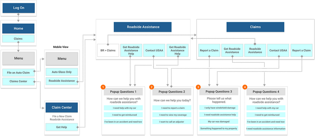
MEMBER FLOW ANALYSIS: EXPLORING TWO ENTRY POINTS
This analysis explores the member journey from two different starting points—one for members and one for non-members. By examining the information architecture (IA) and overall flow, I was able to take a holistic view of the experience and identify potential gaps or areas for improvement.
Non Member view

CLICK IMAGE
TO ENLARGE
Member view
GATHERING INFORMATION I HAVE ALREADY COMPLETED
I analyzed member behavior in the Roadside Assistance flow using Glassbox and journey mapping to uncover user actions, pain points, and drop-off moments. I also reviewed the current information architecture and flow structure to identify areas for improvement.

1
The content should guide members in initiating the claim process. Modifying it could quickly enhance the UX without affecting other components and the structure.
2
In global UX, an arrow indicator typically signals more content or the next step, not the start of a specific action like a claim process. This can lead to confusion and unexpected behavior.
-
Users Are Not Ready To Begin Claim And Need More Information About The Process.
-
Not Qualified - Need To Confirm Their Coverage
-
False Starts - CTAs Are Not Clear

Global Pain Points
We are aiming to address three major pain points based on Roadside experience dropping rates; 42% of Roadside users fall out on page 2.
-
Delivering clear and straightforward content.
-
Improving user flow while maintaining the current structure.
-
Creating prominent primary CTAs for action, including "Get Started," "Confirm Coverage," and "Roadside Assistance Overview."
-
Providing a direct phone number to call if the member is in an accident event.
-
Reusing the claims center's 'Auto Coverage' for coverage confirmation, instead of the legacy feature, makes the process quicker. (See * )
-
Minimizing the need for technical assistance.
Strategy Includes
RECOMMENDATIONS FOR UX & CONTENT IMPROVEMENT
I proposed three options with varying levels of effort—from quick wins to long-term strategies. Each includes clear explanations to align stakeholders and highlight the impact and benefits, allowing us to choose a flexible solution based on our needs and resources.
Less Effort w/ Short-term Solution
More Eftort w/ Long-term Solution
OPTION 1: Changing Content Only
-
Altering the content to sound actionable to make it clear they are starting the claim when they click on their choice. Quick and fast way to improve UX as a short-term solution.
-
The battery icon does not match the title: it looks like a lightning bolt.
-
The back CTA should be return tothe 'Roadside Assistance' screen.

CLICK IMAGE
TO ENLARGE
OPTION 2: Changing Content + Linking to the Storefront Member Home
-
Switch from the card to the message view.
-
Add the new card with 'Coverage confirm' CTA.
-
Altering the content to clarify start of claim.
-
Making each service content action oriented. Include a 'Learn more' CTA, guiding members to the Storefront if they need additional information.
-
The back CTA should be return to the 'Roadside Assistance' screen.
CLICK IMAGE
TO ENLARGE

OPTION 3: Changing Content + Linking for More Information + Removing the Chevron Indicator + Adding a 'Confirm Coverage' CTA
-
Switch from the card to the message view.
-
Create the new card featuring the primary 'Confirm coverage' and 'Get started' CTAs.
-
Altering the content.
-
Remove the chevron indicator.
-
Include a 'Roadside assistance overview' CTA, guiding members to the Storefront if they need additional information.
-
Position the primary 'Request service' CTA at the bottom of the screen.
-
Additional new screen that defines the type of service , due to the removal of the chevron indicator from the Roadside Assistance screen. Help text clarifying the starting point of the claim.
-
The back CTA should be return to the 'Roadside Assistance' screen
CLICK IMAGE
TO ENLARGE

CONDUCTING USABILITY TESTING
Before we finalize our decisions, it's crucial to ensure that our chosen direction is sound and to gather additional feedback from users. While Option 1 involves only content changes, we recognize the importance of validating more comprehensive adjustments. Therefore, we've decided to move forward with testing Options 2 and 3, which encompass broader modifications. This approach will allow us to better assess the effectiveness of these changes, ensure alignment with user expectations, and make informed decisions based on concrete user insights before finalizing our strategy.
1. Overview and Background
After launching the new native Roadside Assistance feature, we observed a drop in containment rates—42% of visitors exited the flow at the second screen.
2. Testing Goals
We have two robust options (Opt2 & Opt3) to evaluate the:
-
Clarity of content
-
Design layout, interactive behavior, primary CTA with labels
-
User flow and easy access to information.
3. User Testing Timeline
This was the timeline and plan I proposed to our team. Given USAA's lengthy process and concerns about timing, our goal was to enhance our testing process and ensure it is completed on time.
CLICK IMAGE
TO ENLARGE

TESTING RESULTS


FINAL OUTPUT HAS BEEN LAUNCHED
The updated features are now live, although the final implementation doesn't exactly match what was originally approved. As a UX designer, I always aim to see the designs we validated with cross-functional teams carried through as planned—but last-minute changes are common. Fortunately, the outcome still performed better than the previous version. We're actively monitoring performance, and once additional funding becomes available, we plan to implement the remaining updates.

SCROLL TO VIEW THE INTERACTIVE MOCKUP
LET ME SHARE WHAT WE LEARNED FROM THIS PROJECT — OUR REALITY VS. OUR AMBITION
After completing this project, we realized it took much longer than we expected. My director and I wanted to better understand the gap between our current reality and our ambition. At USAA, insurance products go through several layers of review before release, including strict legal processes. These necessary steps caused delays we hadn’t fully anticipated. To help clarify these challenges, I visually mapped out the issues and proposed a more effective Agile workflow. We’re eager to improve our process, but it requires collaboration and support from other stakeholders across teams.
Non Member view

VS.


