


Restructuring Product Navigation to Improve Discovery
PROJECT OVERVIEW
We updated our Enterprise Navigation Systems and now need to understand the strengths and weaknesses of competitors and other SaaS companies. By comparing and learning from them, we aim to uncover better solutions and address pain points in our own system. Through this research and analysis, we expect to attract and win new customers. https://www.bigcommerce.com
ROLE & RESPONSIBILITY
-
Led UX exploration of enterprise navigation across complex product ecosystems
-
Conducted research and personas to identify gaps and inform decisions
-
Improved navigation to enhance discoverability, efficiency, and scalability
-
Designed scalable IA, wireframes, and interaction models
-
Validated through A/B testing and data-driven iteration
-
Collaborated cross-functionally to align business and technical needs
ANALYZE & COLLECT CTR RATE

CLICK IMAGE
TO ENLARGE

Jul '21 to Sep '22 Range 20,000 - 47,000 11,000 - 20,000 4,000 - 11,000 0 0 - 4,000

COMPARATIVE RESEARCH
-
Find Out what "they" have and what we don't
-
Traffic
-
Comparison Charts
-
Functionality
-
Structure
-
Style
-
Features
-
Link: Placement, Labels, and Shapes


CUSTOMER PERSONA & JOURNEY MAP
I created customer personas and a journey map. These deep dives allowed us to gain more detailed insights into best practices for our users and their behavior patterns and preferences. These findings provided valuable information that informed our navigation design decisions and helped us create a more user-centric experience.
CLICK IMAGE
TO ENLARGE


FINAL INFORMATION ARCHITECTURE
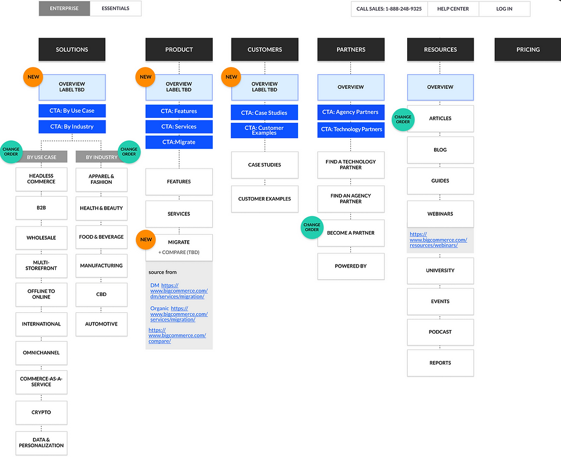
CLICK IMAGE
TO ENLARGE
OVERVIEW USER TESTING
We want to confirm that these overview pages help our users find the best practices, and we can integrate them into other pages. We also want to test if desktop and mobile have other users' behavior or results.
1. Goal
-
Clarity of content
-
Design layout, interactive behavior, primary CTA with labels
-
User flow and easy access to information.
2. Highlight of Key Takeaways
-
Overall positive feedback covering the overview pages.
-
Confirming the direction of overview pages.
-
The overview gives a quick tour of the platform and understanding of the contents.
-
Desktop view has more positive results for overview of effectiveness. It’s reasonable to assume that with the size of the screen.
-
The overview page needs enough information but considers the minimum amount of information our users need to accomplish their task.

STICK-TO-SCROLL CTA A/B TESTINGTested two visual treatments with the same CTA order: Call Sales (1-888-248-9325) and Log in at the bottom. Evaluated variations in order and placement to improve UX, increase leads, and provide easier access to contact and login.
OPTION A
Primary CTA being the sales number, and secondary being log in
OPTION B
Primary CTA being the log-in and secondary being the sales number

FINAL PROTOTYPE & MOCKUP
NAVIGATE THROUGH THE INTERACTIVE MOCKUP
FINAL PROTOTYPE & MOCKUP
NAVIGATE THROUGH THE INTERACTIVE MOCKUP
POST-RELEASE INSIGHTS & NEXT STEPS FOR NAVIGATION ECOSYSTEM
After Enterprise Navigation, shifted focus to Essential Navigation and related pages (Help Center, Apps, Microsites, Campaigns). Ecosystem map shows how these connect, creating a more integrated experience.
Post-release data shows high engagement with links like “Pricing” (14,295 clicks), “Menu,” and “Start your free trial.” However, the presence of “undefined” (4,460 clicks) signals a tracking issue to fix.
Mobile usage rose to 38.6%, but mobile signups lag at 26.6% versus 72.6% on desktop—highlighting the need to improve mobile conversion paths.
Ecosystem Map

Page Traffic
Users click on the following links:

Devices Traffic
Devices used by visitors to the /enterprise/ section of the site.

US Enterprise Pages


