


Enhancing the End-to-End Payments Experience
PROJECT OVERVIEW
We discovered that over 60% of users abandon the payment process after selecting a plan. This trend appears across various entry points—whether users are finishing a 14-day trial, visiting the BigCommerce portal, or accessing the product directly. The abandonment rate is higher than expected, prompting us to explore alternative checkout flows and funnels to address this issue.
ROLE & RESPONSIBILITY
-
Led UX design for payment funnels and checkout optimization
-
Conducted comparative research and analyzed user behavior to reduce friction
-
Designed user flows, journey maps, and pricing strategies for improved conversion
-
Validated solutions through testing and iteration (CTR/CRO)
-
Identified mobile issues and collaborated cross-functionally to improve experience consistency
UX RESEARCH – PAYMENT PROCESS
Conducted competitor research on onboarding funnels and checkout experiences. Identified best practices and opportunities to improve our payment flow.


CLICK IMAGE
TO ENLARGE


CLICK THE THUMBNAIL ORUSE THE SIDE ARROWS TO VIEW
UX RESEARCH – SUBSCRIPTION PRICING: INCLUDING OR EXCLUDING TAXES
Handling taxes in checkout can be complex. Conducted segmentation research to identify clear display patterns.
Improved transparency to reduce confusion and increase trust during the final step.
CLICK IMAGE
TO ENLARGE


CLICK THE THUMBNAIL ORUSE THE SIDE ARROWS TO VIEW
1. Checkout Funnel - Abandonment Rates

2. Pricing Page - Evidence

3. Trail CTR


PRICING STRATEGIES WITH RECOMMENDATIONS
Researched and analyzed pricing as a key part of the payment process. Developed 10 recommendations to improve functionality and enhance the overall payment experience.
CLICK IMAGE
TO ENLARGE


CLICK THE THUMBNAIL ORUSE THE SIDE ARROWS TO VIEW
EXPLORING USER FLOW OPTIONS
To improve clarity and engagement across different user entry points, I created three custom funnels representing unique use cases. These variations allow us to track behavior more precisely and tailor experiences to user intent. With these insights, we can make informed, data-backed decisions to optimize the overall user journey.
CLICK IMAGE
TO ENLARGE


SELF - STORE PROFESSIONAL SERVICE USER FLOW
Created journey maps for three segments: single-store paid, multi-store paid, and free trial users.
Mapped experiences from the control panel to identify needs, behaviors, and pain points, informing data-driven improvements.
CLICK IMAGE
TO ENLARGE


.png)
NAVIGATE THROUGH THE INTERACTIVE MOCKUP
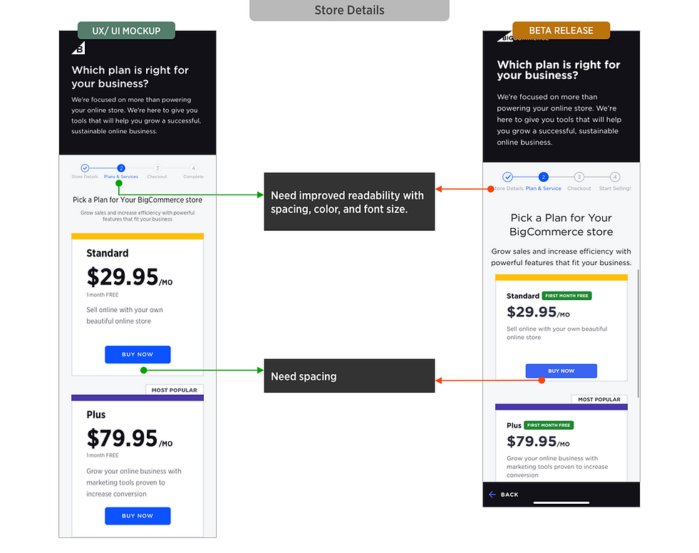
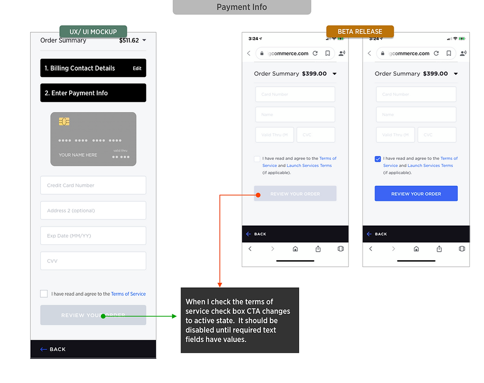
BETA RELEASE REVIEW FOR MOBILE VIEW
Identified mobile-specific UX issues after beta, including broken features and UI inconsistencies. Documented findings and partnered with engineering to prioritize fixes and improve the experience..


NEXT STEP
After running the tests, we'll have data on both the CTR and CRO, which we'll need to finalize. Additionally, we currently offer multiple payment processes within the product, which can be confusing for users due to differences in experience and content. To address this, we should improve and align these two interfaces to provide a consistent user experience.


