top of page


Streamlining the Mobile Roadside Assistance Flow
PROJECT OVERVIEW
42% of members dropped off on the second screen after launch. Conducted focused analysis to identify friction points and delivered targeted UX improvements, stabilizing the experience and increasing engagement.
ROLE AND RESPONSIBILITY
-
Led end-to-end mobile UX for Roadside and Claims
-
Created user flows, information architecture, and wireframes
-
Identified friction in FNOL and roadside journeys to improve usability
-
Refined designs through testing, data insights, and cross-functional collaboration (including Agero)
DFNOL AND ROADSIDE JOURNEY MAPPING
A holistic DFNOL journey map covering Used to analyze entry points and the end-to-end experience. Roadside Assistance and Repair/Arrange.
SCROLL TO VIEW THE INTERACTIVE MOCKUP


GLASSBOX DEEP DIVE INTO MEMBER CLAIM FLOWS
Inspired by Glassbox, this analysis examines real member behavior in the Roadside Assistance flow.
Identified key friction points and opportunities to improve navigation and overall UX.

CLICK IMAGE
TO ENLARGE

MEMBER FLOW ANALYSIS: EXPLORING TWO ENTRY POINTS
Analyzed member and non-member entry points to understand the full journey. Reviewed IA and flows to identify gaps and opportunities for improvement.
Non Member view

CLICK IMAGE
TO ENLARGE
Member view
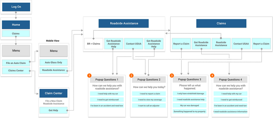
GATHERING INFORMATION I HAVE ALREADY COMPLETED
Analyzed member behavior in the Roadside flow using Glassbox and journey mapping.
Identified pain points, drop-off moments, and gaps in the current IA and flow.

1
The content should guide members in initiating the claim process. Modifying it could quickly enhance the UX without affecting other components and the structure.
2
In global UX, an arrow indicator typically signals more content or the next step, not the start of a specific action like a claim process. This can lead to confusion and unexpected behavior.
Global Pain Points

We are aiming to address three major pain points based on Roadside experience dropping rates; 42% of Roadside users fall out on page 2.
-
Users Are Not Ready To Begin Claim And Need More Information About The Process.
-
Not Qualified - Need To Confirm Their Coverage
-
False Starts - CTAs Are Not Clear
-
Delivering clear and straightforward content.
-
Improving user flow while maintaining the current structure.
-
Creating prominent primary CTAs for action, including "Get Started," "Confirm Coverage," and "Roadside Assistance Overview."
-
Providing a direct phone number to call if the member is in an accident event.
-
Reusing the claims center's 'Auto Coverage' for coverage confirmation, instead of the legacy feature, makes the process quicker. (See * )
-
Minimizing the need for technical assistance.
Strategy Includes
RECOMMENDATIONS FOR UX & CONTENT IMPROVEMENT
Proposed three UX and content improvement options, from quick wins to long-term strategies.
Outlined impact and trade-offs to align stakeholders and support decision-making.
Less Effort w/ Short-term Solution
More Eftort w/ Long-term Solution

OPTION 1: Changing Content Only
-
Updated content to clearly signal claim start. Quick short-term UX improvement.
-
The battery icon does not match the title: it looks like a lightning bolt.
-
The back CTA should be return tothe 'Roadside Assistance' screen.

CLICK IMAGE
TO ENLARGE
OPTION 2: Changing Content + Linking to the Storefront Member Home
-
Switch from the card to the message view.
-
Add the new card with 'Coverage confirm' CTA.
-
Altering the content to clarify start of claim.
-
Made service content action-oriented and added a “Learn more” CTA to guide members to the Storefront.
-
The back CTA should be return to the 'Roadside Assistance' screen.
CLICK IMAGE
TO ENLARGE

OPTION 3: Changing Content + Linking for More Information + Removing the Chevron Indicator + Adding a 'Confirm Coverage' CTA
-
Switch from the card to the message view.
-
Create the new card featuring the primary 'Confirm coverage' and 'Get started' CTAs.
-
Altering the content.
-
Remove the chevron indicator.
-
Include a 'Roadside assistance overview' CTA, guiding members to the Storefront if they need additional information.
-
Position the primary 'Request service' CTA at the bottom of the screen.
-
Added a new screen to define service type after removing the chevron. Included help text to clarify claim start.
-
The back CTA should be return to the 'Roadside Assistance' screen
CLICK IMAGE
TO ENLARGE

CONDUCTING USABILITY TESTING
Conducted usability testing on Options 2 and 3 to validate broader UX changes.
Gathered user feedback and insights to ensure alignment and guide final decisions.
1. Overview and Background
After launching the new native Roadside Assistance feature, we observed a drop in containment rates—42% of visitors exited the flow at the second screen.
2. Testing Goals
We have two robust options (Opt2 & Opt3) to evaluate the:
-
Clarity of content
-
Design layout, interactive behavior, primary CTA with labels
-
User flow and easy access to information.


FINAL OUTPUT HAS BEEN LAUNCHED
The updated experience has been launched, with some last-minute changes from the original design.
Despite differences, performance improved, and we continue to monitor results and plan further updates.

SCROLL TO VIEW THE INTERACTIVE MOCKUP
LET ME SHARE WHAT WE LEARNED FROM THIS PROJECT — OUR REALITY VS. OUR AMBITION
This project took longer than expected, revealing a gap between our reality and ambition. Mapped process challenges—including legal reviews—and proposed a more effective Agile workflow to improve delivery.
Non Member view

VS.


bottom of page